My Open Studio at Artspace October 14th & 15th was a great opportunity to put some ideas in front of an new audience. This was a different kind of showing experience for me. Unlike my exhibition experience, the work I had out to view was in progress and not completely finished. The Open Studio program at Artspace did not occur in the actual studio that I have been working in for the past 3 months but instead another empty room was provided. This is a curious set up that took me some time to get my head around. Not quite an exhibition yet not a working studio either. In terms of the emotional and physical process, it felt the same as a public exhibition. I had to regularly remind myself of the works in progress mandate and to measure my perfection barometer.
The resulting collection of works do relate to one another, some more tenuously then others. I see this collection of works as a series of distinct beginnings. Some are clearly progressions from older work and others like #3 signal unique terrain. In terms of conversations around the work, I had more interesting and engaging discussions in this Open Studio format than I have experienced in exhibitions. To a certain extent I guess the finished artwork speaks for itself. At openings or during exhibition time I tend to talk more about how I reached the configuration of what we are looking at. This was different to the Open Studio, in that conversation was more reciprocal and open - it is a discursive translation of the physically "Open Studio" I guess.
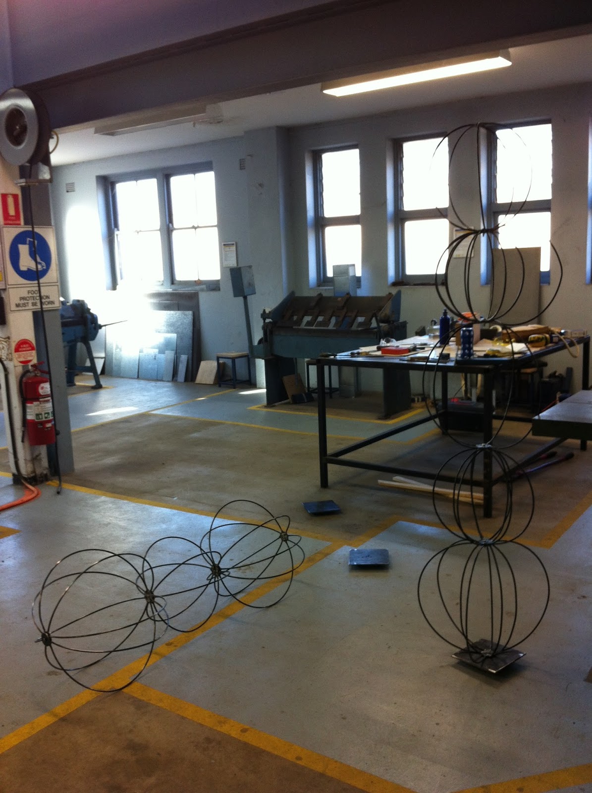
Following is some stills of the set up and some notes I have made in regard to possible directions and thoughts on these new works.
I enjoy the mesmerising quality of this moving image work. The 4 plans of incidence (4 surfaces animated with light) in this work inspires further investigation. In that, I would like to install this work on its own and create a more directional progression through the work. The 4 plans of incidence could be more purposeful. I think the 2 middle plans could be more sculptural as well as maintaining the shadow play quality of a surface to be projected onto. In this configuration I added a sound component too. The sound was a slowly spoken letter "O". This sound bite is from an older work, but in this context was reminiscent of the "Om" of Buddhist meditation, the sound of a ships fog horn or some people said the sound of bees.

(Yo) U know is a positive affirmation of aesthetic self belief. The centre of the mirror is scraped away, so as to not reflect ones face. This work could perhaps be mounted on a wall at head height with the letters KNOW installed at a right angle from the wall, like a shelf.

This work is a self generating system. The dimensions, colours and shapes are dictated by an initial form. In this case the initial form was the 3 ply corrugated cardboard. The wave-like pattern of the cardboard structure is echoed with the concentric rings of a target. The 5 rings are separated and staggered around a central axis. The dimension of the circumference of the 2nd ring is the length of one of the sides of the plywood panel base. Similarly, the dimension of the circumference of the 3rd ring is the length of the longest side of the plywood panel. The long rod has the function of a compass but refers to more then this humble system. This is suggested by the compass positioning that is at once the centre but curiously out on the edge.


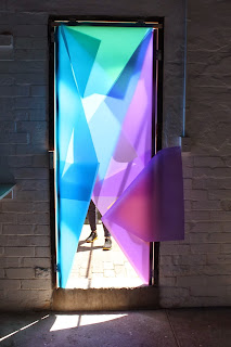
These window drawings are an extension of my work on the parameters of perception. This work references a target and the biological eye, specifically the pupil. This target, eye like shape is also a pun for the subjective notion "I". In so doing, the eye in I refers to the philosophical tradition of dialogue around the nature of self.
The colours of this piece are drawn from the surrounding sea and sky. Intense and unnatural the colours are an exaggeration of what is outside the window. I am playing with presence and absence in the way the material is applied to the window as well as the way the reflections and shadows are cast on the walls and floor inside of the building. In the context of this site the target/eyes may be read to reference the portholes of ships and nautical implements like sun dials.
The Aye Aye screen geometrically counters the curved reflections from the windows. On a sunny day between the afternoon hours of 2-5pm the shadows project coloured light onto the white Aye Aye screens. The phrase Aye Aye responds to the nautical site of Woolloomoolloo wharf but falls short of the Aye Aye Captain refrain. Aye Aye is also a play on words with the eye/I from the windows. Similarly, "Aye" conjures the "Och aye" of my Scottish ancestry. In so doing, the Aye Aye becomes a double affirmative "yes, yes".
Ha Ha Ah Ah has a lot of potential. Initially I was using the stool to lean the tower of A's against. I realised the simple black curved lines of the stool complimented the white angles of the A tower well, so I integrated the stool into the structure of the A tower. There is an interesting play with absence of the body and absence within the letter shapes. The H didn't get very far off the ground. I do like the white tape against the shiny imperial blue perspex.
Most Photographs by Joy Lai
This
Yellow and orange Aye Aye, work has potential. It could be a Marquette for a large outdoor work for example. Image if we were the height of the letter Y, and the letters F and A could be grass....One of the problems would be translating the yellow and orange material in large scale.